 Graphic Designer | Toronto, Ontario
kat print studio
branding | 2019
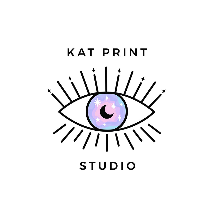
I created this logo design for my Etsy shop. Since this is my main creative outlet, I wanted this branding to represent my spirit and capture the creativity I've had since I was a child. The colour palette was inspired by my childhood as well. I grew up in the 1990’s, purple, pink and blue were infused in my brain.
At a young age I had a subconscious fascination with eyes and I’ve always drawn them. Whether it was on school note paper or sketch books, it was always a thing I did. It was the symbol I connect with most and it seemed appropriate to represent my brand. The stars in the eye were added for an extra “magical” touch and because I find lots of inspiration from the cosmos.
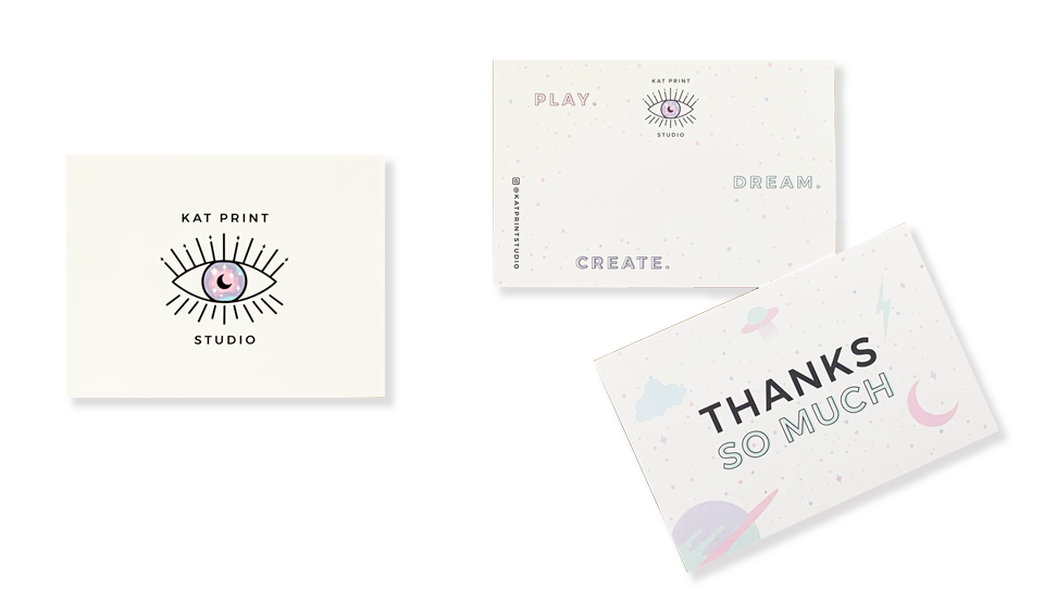
I wanted to add a thank you and a branded postcard in each package when I ship my ordered posters from Etsy. The slogan for my shop is “play, dream, create”. I wanted the thank you card to have a light fluffy and fun feeling while using my branded colour palette. I love doodles, illustrations and magical things and wanted that represented in the design as well.
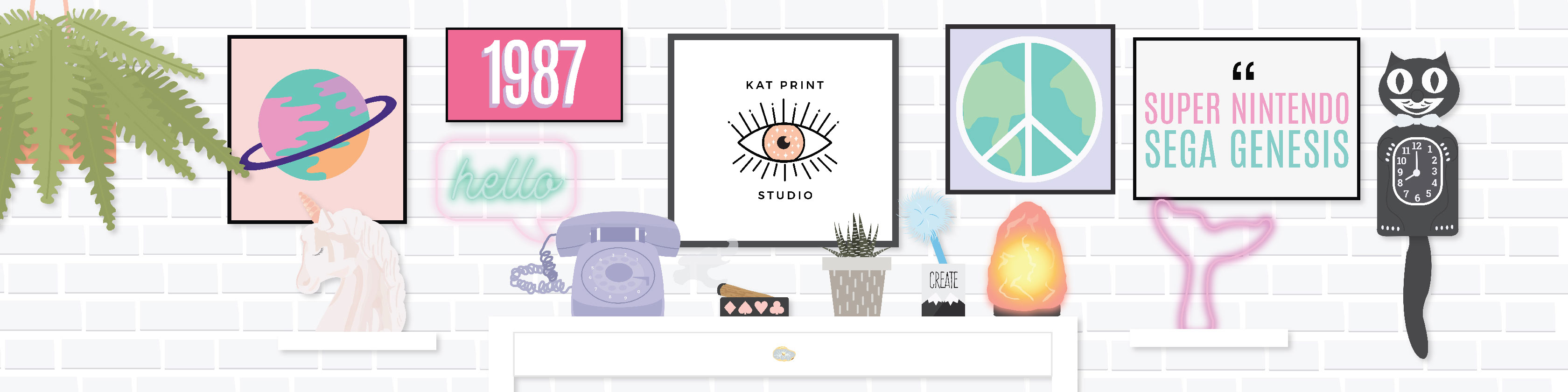


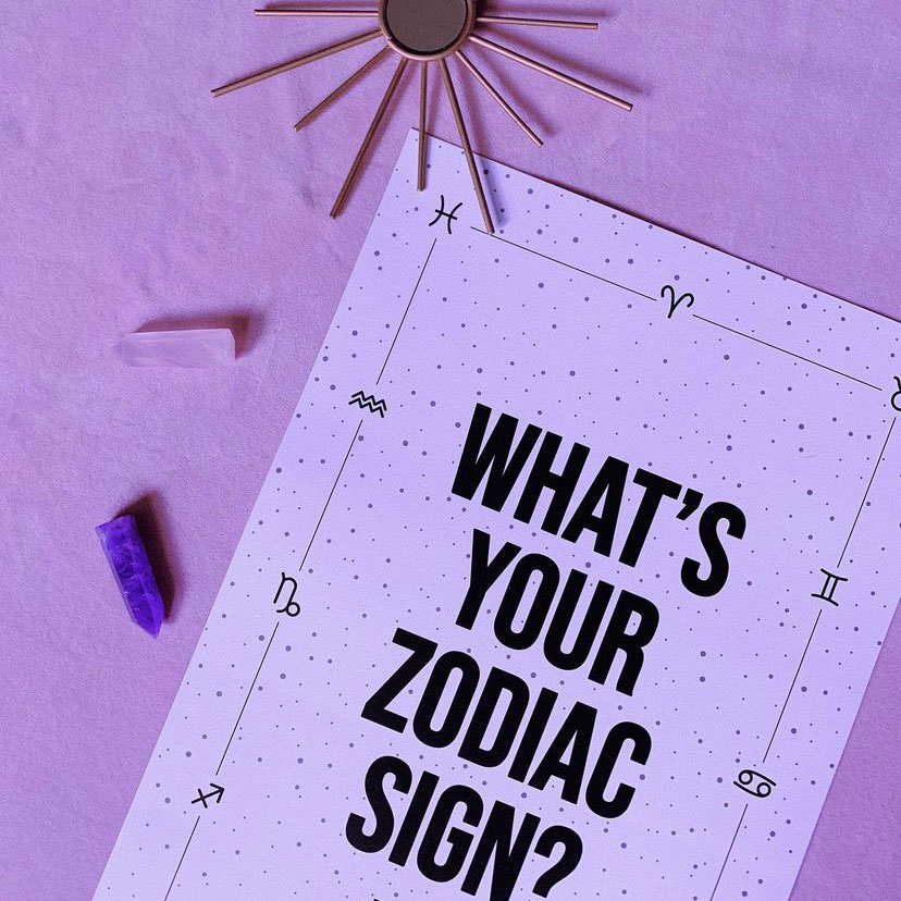
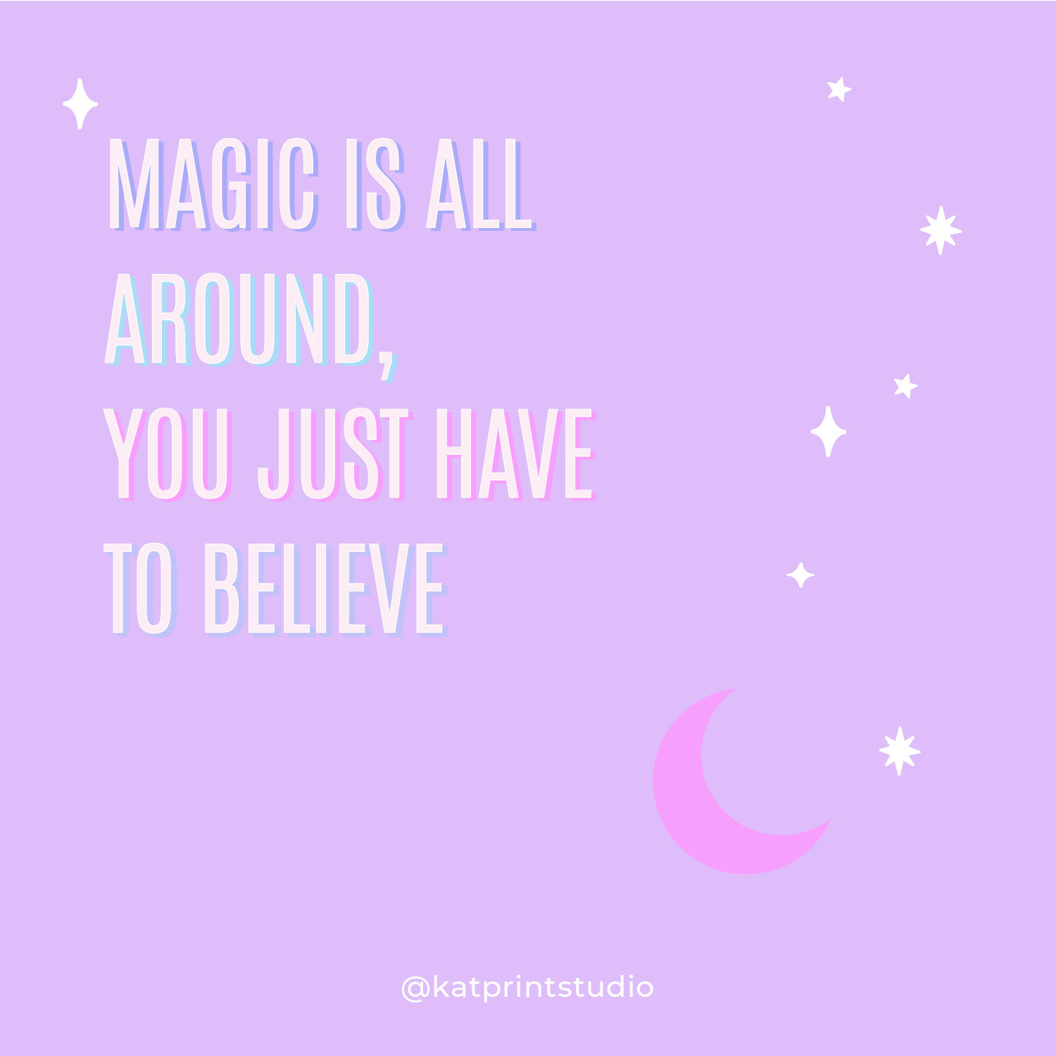
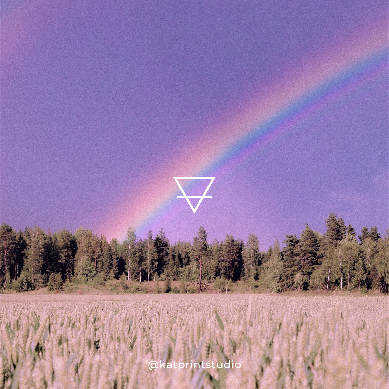
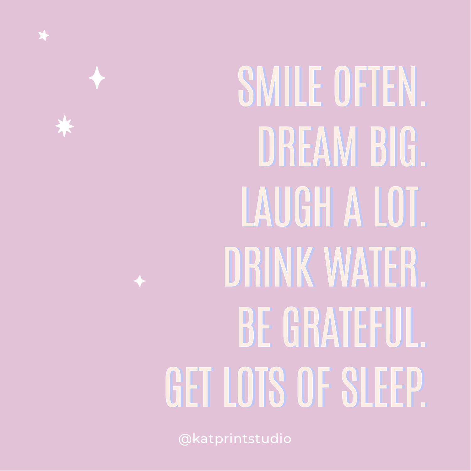
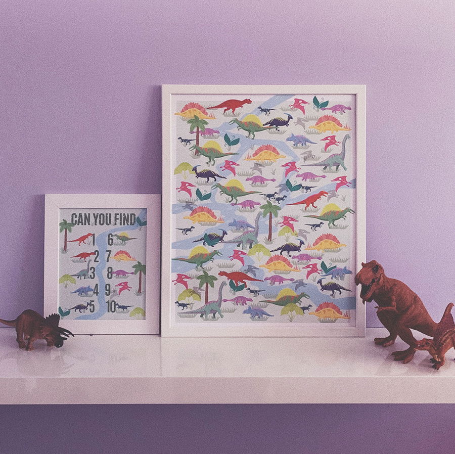
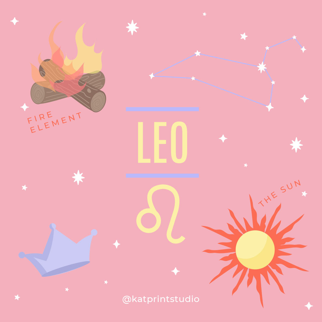

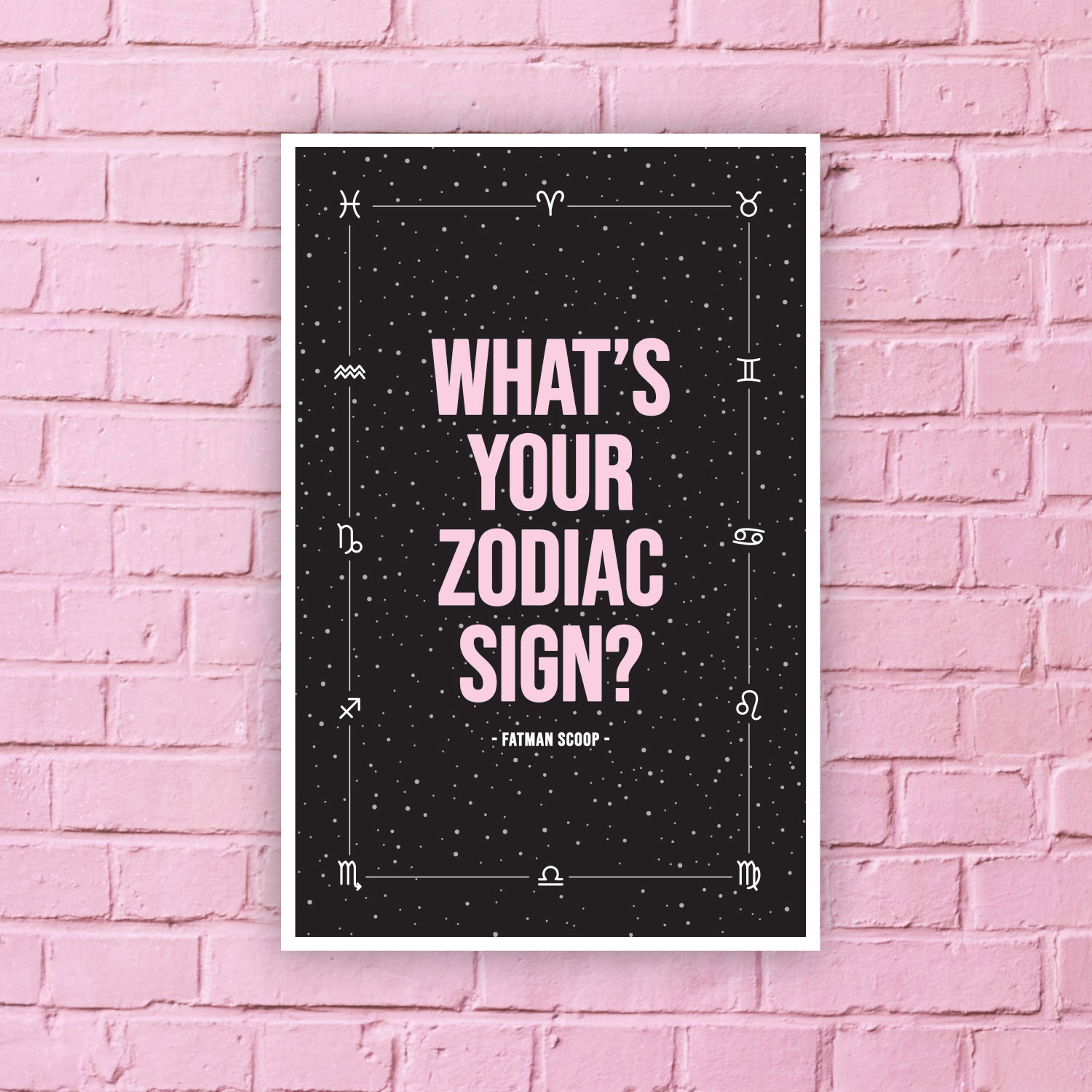
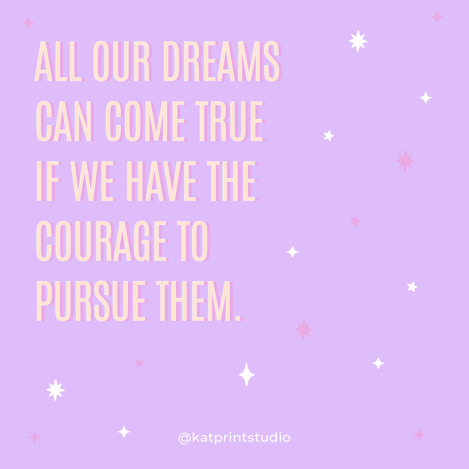
The social media content that I create for my etsy instagram account is meant to reflect my creativity and people with similar interests. The main target is people who were likely born in the 80’s and raised in the 90’s, people that get nostalgic fuzzy feelings when they see things from our childhood AND people who enjoy reading about astrology. My focus for the posts is to be light-hearted, fun, creative and to advertise my prints.