 Graphic Designer | Toronto, Ontario

Melanie & Steve
wedding | 2017
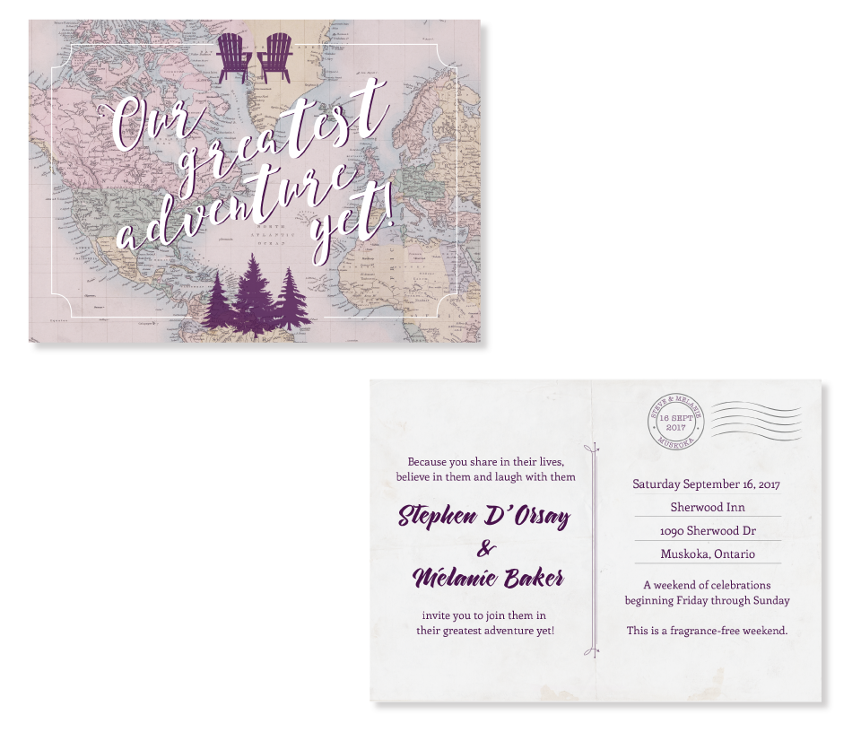
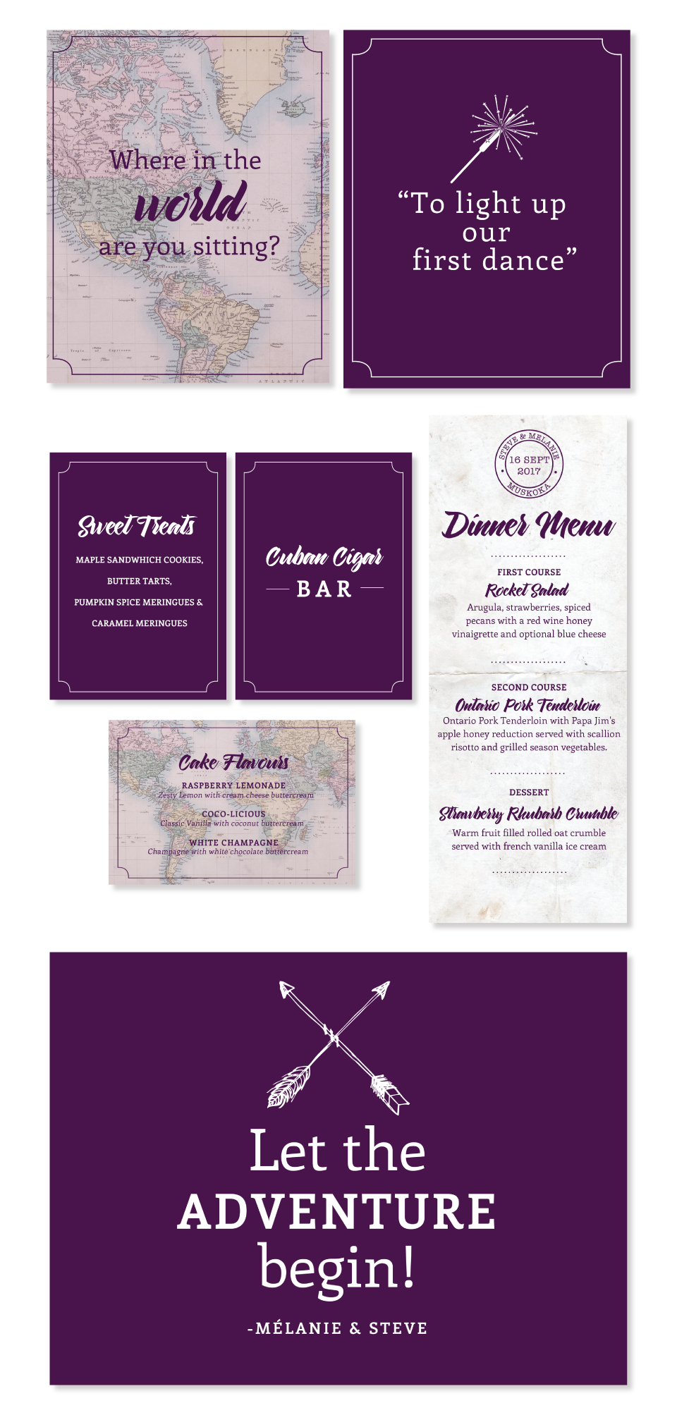
Since this couple was big on travelling, they had decided that the theme of their wedding would be adventures, maps and different places they have visited. They wanted a vintage look mixed with Muskoka elements since the nuptials were taking place there. Melanie had the idea to make the invitation look like a postcard.

The couple’s main wedding colour was purple. They had a lot of fun events planned for the wedding weekend and needed food & direction signage.

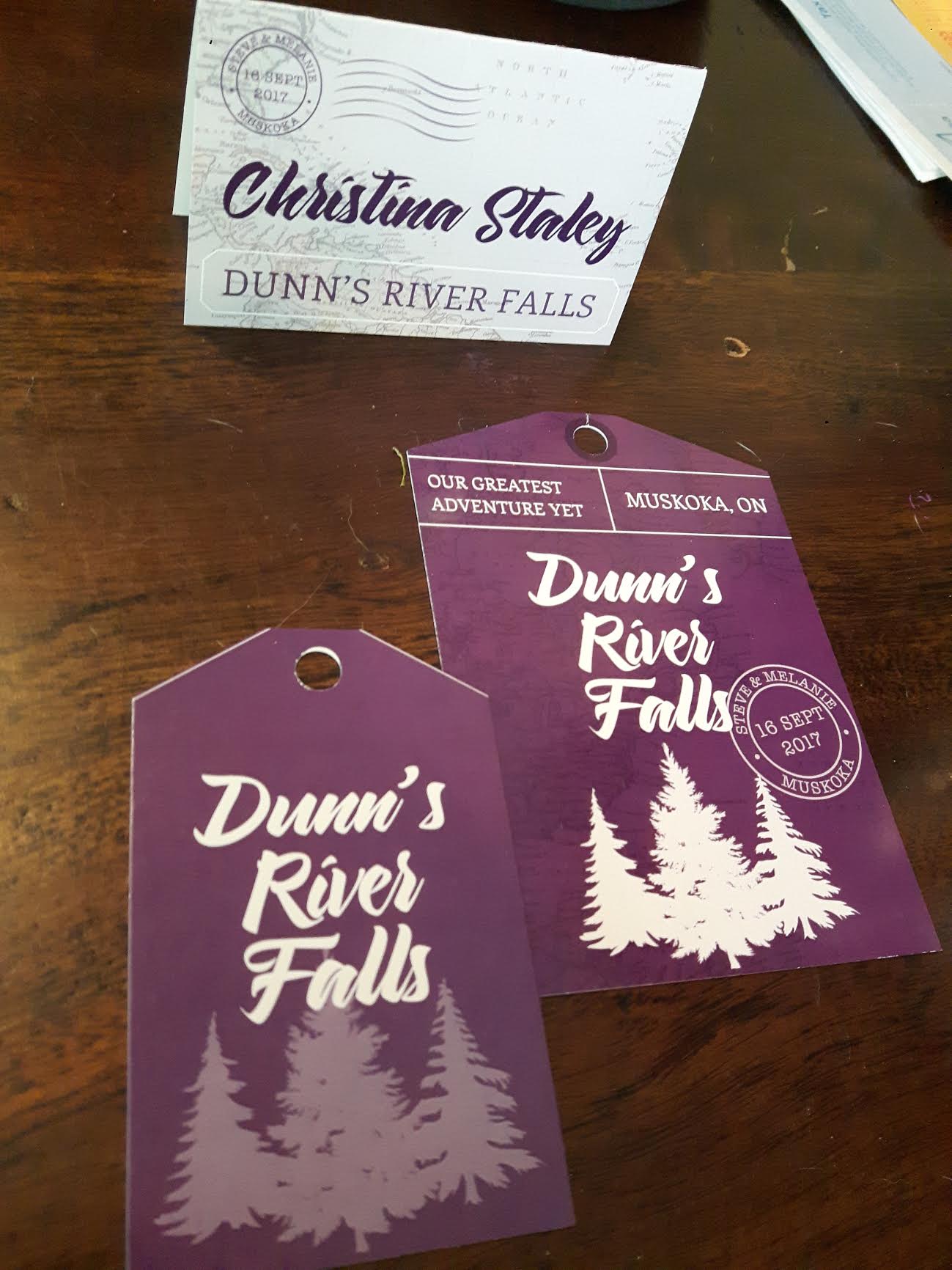
Instead of using numbers to assign the tables, they used all the place names that they have visited.